
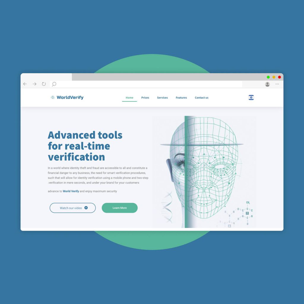
We designed an intuitive and state-of-the-art digital presence for the facial recognition platform, emphasizing its smart and innovative design, through a complete website overhaul. This strategic enhancement not only significantly elevated the brand’s online visibility but also effectively articulated the unique benefits and crucial relevance of this platform for facial recognition to the target audience, making the identification process not just seamless, but extraordinarily precise.
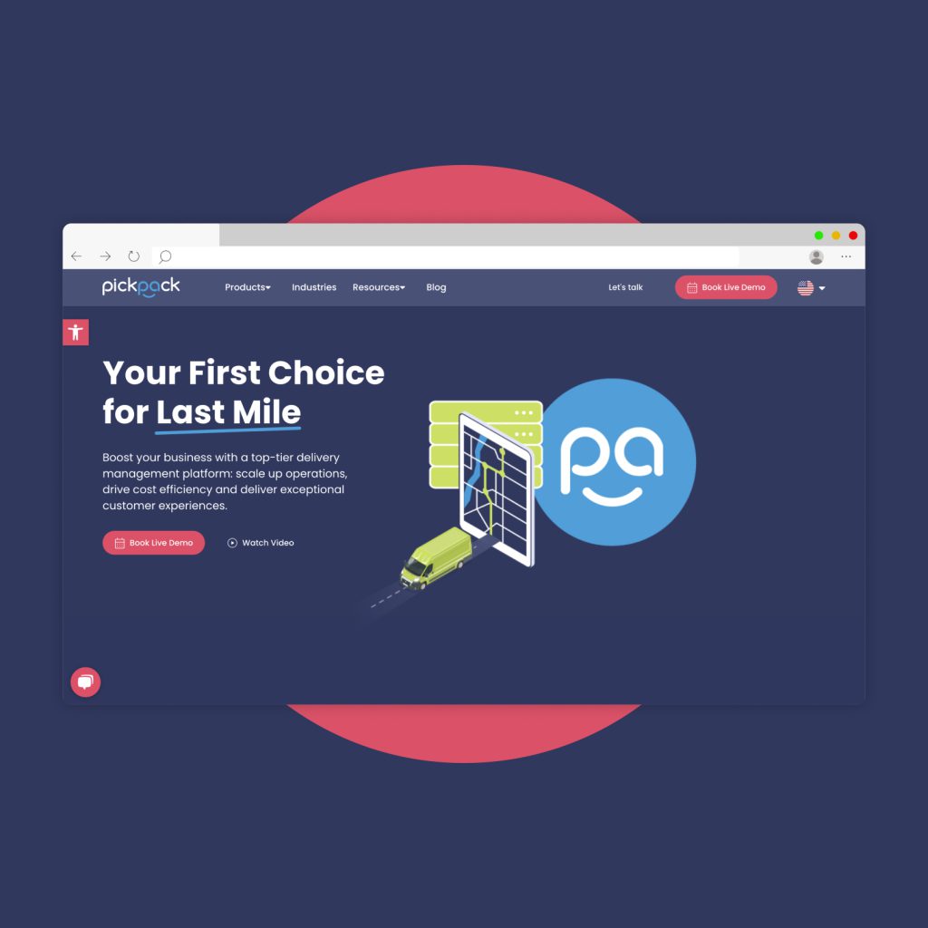
We developed an intuitive and modern digital interface for the delivery services management platform, highlighting its smart and streamlined design, through a thorough overhaul of their website. This strategic improvement not only significantly enhanced the brand’s online visibility but also effectively communicated the unique advantages and essential value of this platform for orchestrating delivery services to the target audience, making the management process not only seamless but highly efficient.
To cultivate enduring brand loyalty and community connections, our designs were meticulously formulated to represent the brand’s central mission and crucial role in promoting improvements both locally and worldwide. This approach successfully deepened confidence in the platform and encouraged persistent engagement, underpinning the brand’s continuous development and stature in the sector.
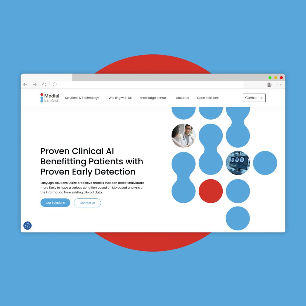
We forged a commanding digital presence for the corporation, highlighting its innovative approach to uncovering latent illnesses, by revolutionizing their web platform with a cutting-edge, user-friendly design. This tactical enhancement not only expanded the company’s online prominence but also efficiently conveyed the unique benefits and intrinsic importance of their groundbreaking disease detection technologies to a targeted global audience.
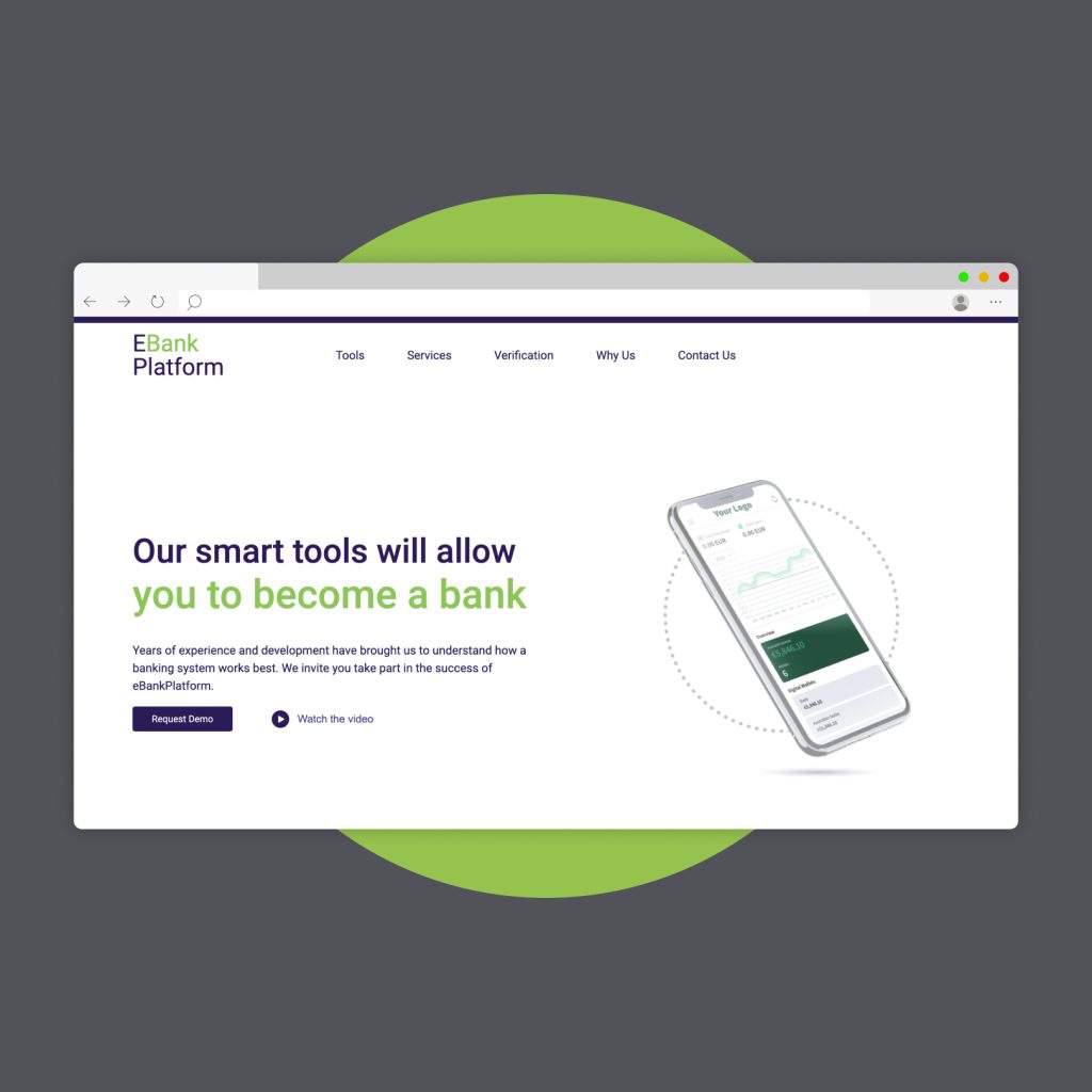
We constructed a formidable online presence for the bank, emphasizing its pivotal role in financial empowerment, by overhauling their digital platform with an intuitive, contemporary design. This strategic move not only heightened the bank’s online visibility but effectively communicated the distinct advantages and fundamental virtues of banking with this institution to our targeted demographic.
Furthermore, our enhancements were strategically aimed at boosting the platform’s conversion rates, seamlessly transitioning site visitors to engaged customers. Through meticulous user experience optimization and precision-targeted marketing initiatives, we didn’t just amplify the platform’s operational efficacy; we drew in a fresh influx of patrons, broadening the bank’s digital footprint and cementing its stature in the online banking sector.
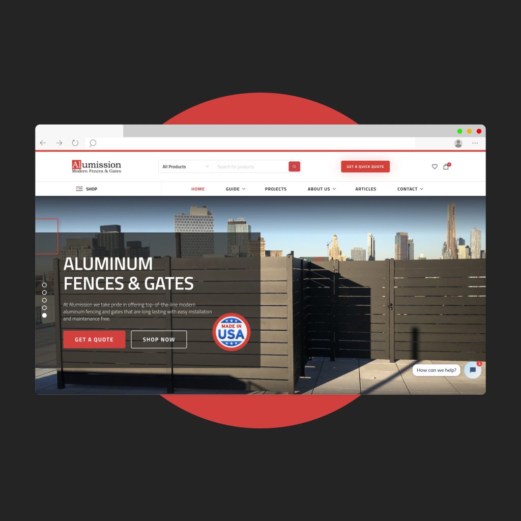
We developed a high-conversion website for aluminum fences and gates, utilizing our deep understanding of customer behavior to boost sales. Our strategic expertise facilitated an intuitive layout and seamless navigation, heightening user engagement and catalyzing increased transactions.
In the subsequent phase, our focus shifted to cultivating brand loyalty through interactive features and adaptive design. This approach solidified user trust, spurred repeat visits, and fostered a community around the brand, laying the groundwork for consistent long-term growth.
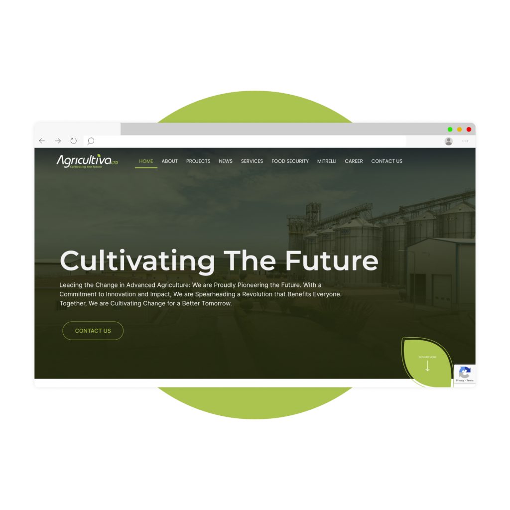
Forging a strong brand that reflects its impactful contributions to the world and Africa specifically, we transformed their agricultural projects website with a sophisticated, contemporary design. This strategy not only elevated brand awareness and highlighted its leadership in the market but also distinctly communicated the brand’s values and considerable positive influence.
Building a powerful brand to underscore its essential role in e-commerce, revamping their sales platform with a simple, fresh design. This approach elevated the brand’s visibility, showcased its leadership, and conveyed the specific benefits and core attributes of this platform to our target audience.
In addition to the initial transformation, we implemented strategies aimed at enhancing the site’s convertibility, turning visitors into customers. By optimizing user experience and employing targeted marketing techniques, we not only improved the platform’s efficiency but also attracted a new wave of clientele, expanding the brand’s reach and solidifying its presence in the e-commerce arena.
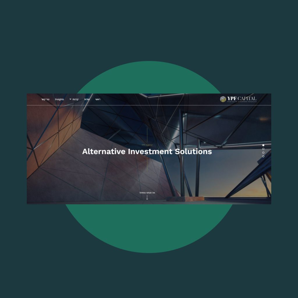
Branding, characterization and Corporate web development of the fund specializes in the management of investment portfolios for investors in the scope of millions of Shekels while managing risks and writing detailed strategic plans.
The main website was to produce a site that provides content that helps filter potential clients who do not meet the entry threshold for the fund.
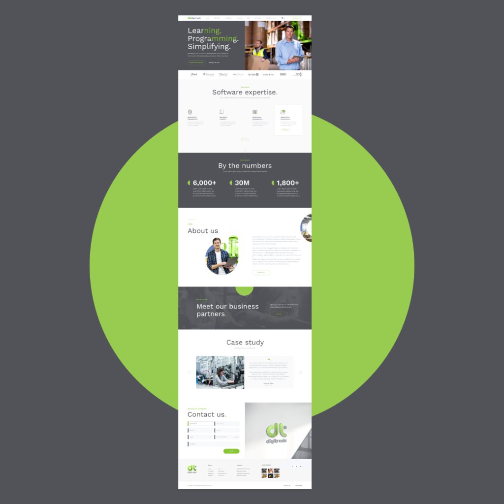
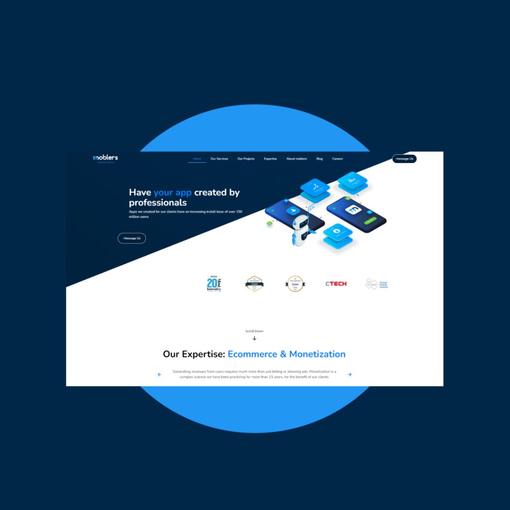
Design for a software company that specializes in managing multiple teams working on cutting-edge technologies and making complex interfaces. Under the umbrella of innovation and careful design, the new site is a big step forward in terms of animations, user experience, and the customer journey.
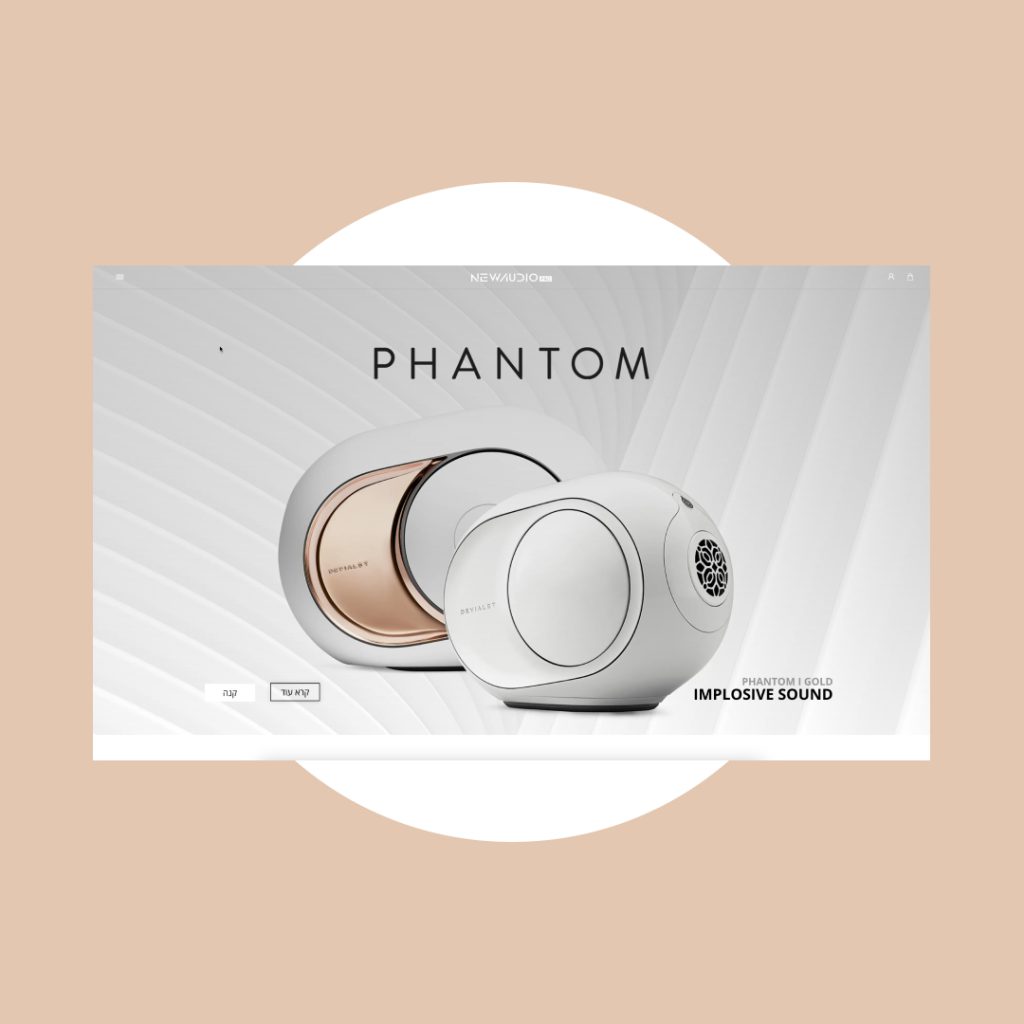
The design and development of a sales website for Devialet, a leader in the audio industry that redefines luxury worlds. As part of the project, product specs had to be made available, and a store had to be built with simple buying procedures and a welcoming user interface.
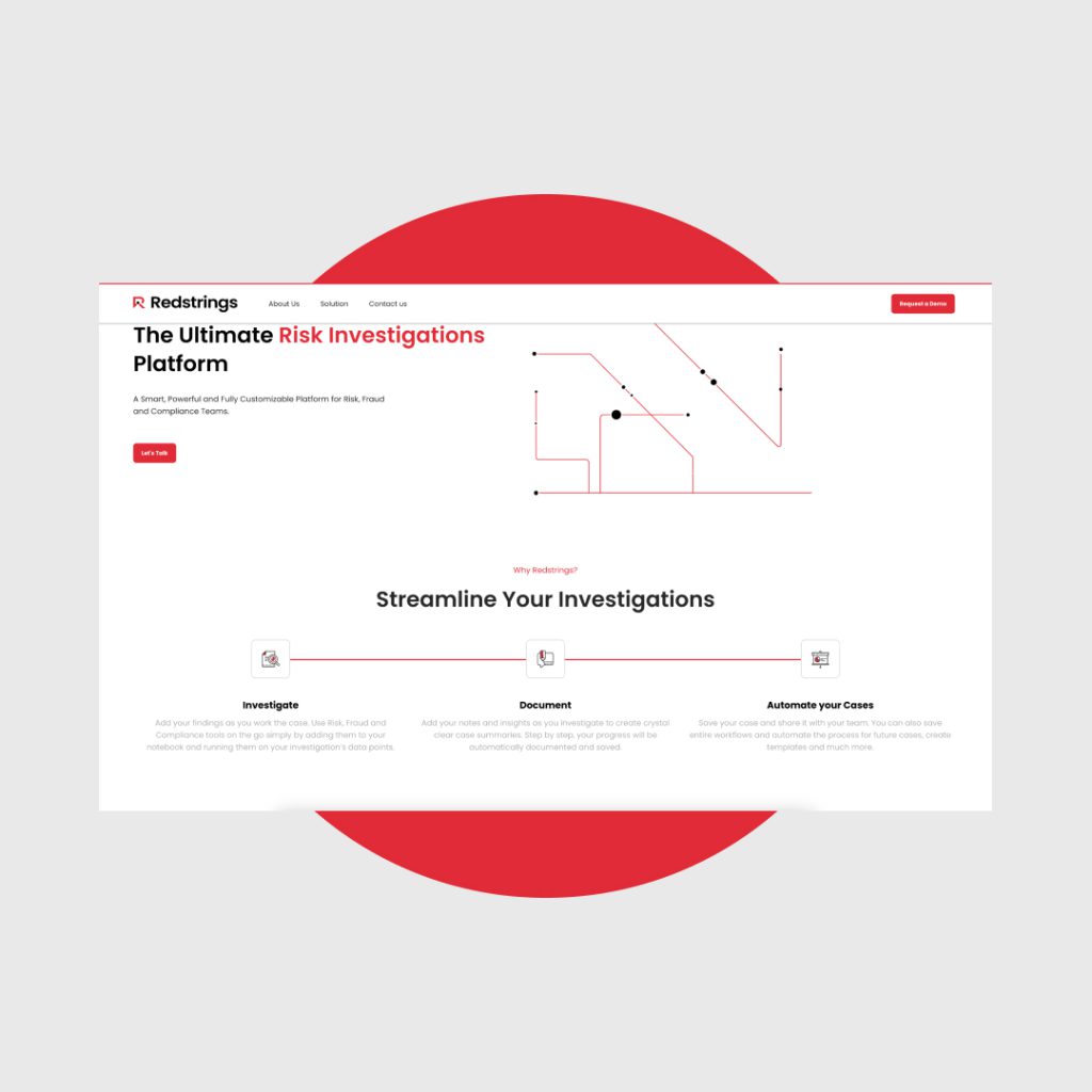
Design, branding, and creation of an image website for a cyber corporation that maps procedures and security lapses and generates a grid for risk management and more secure management of digital assets.
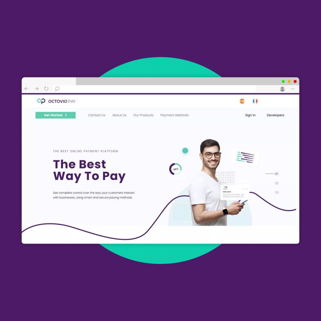
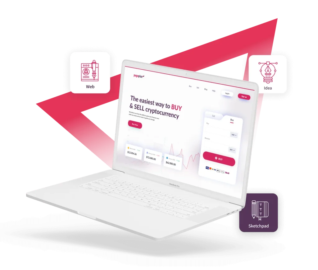
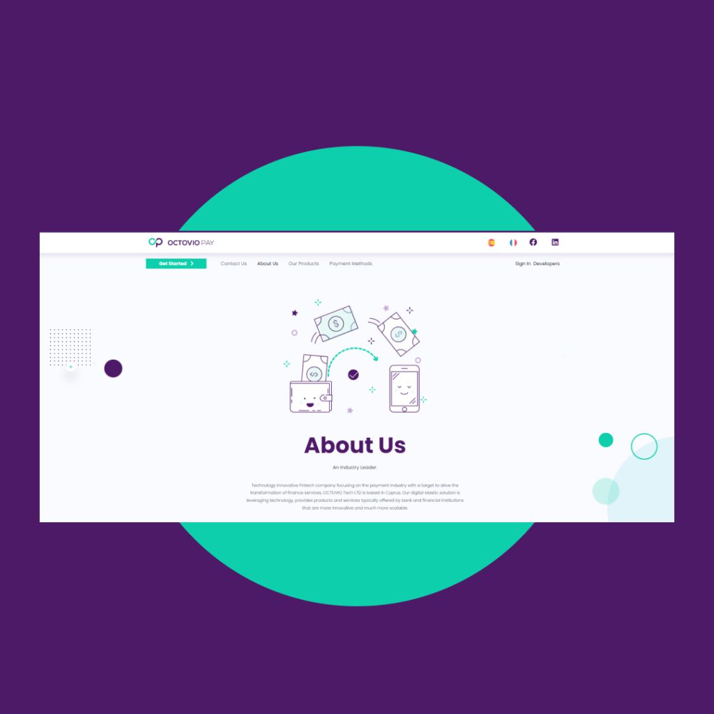
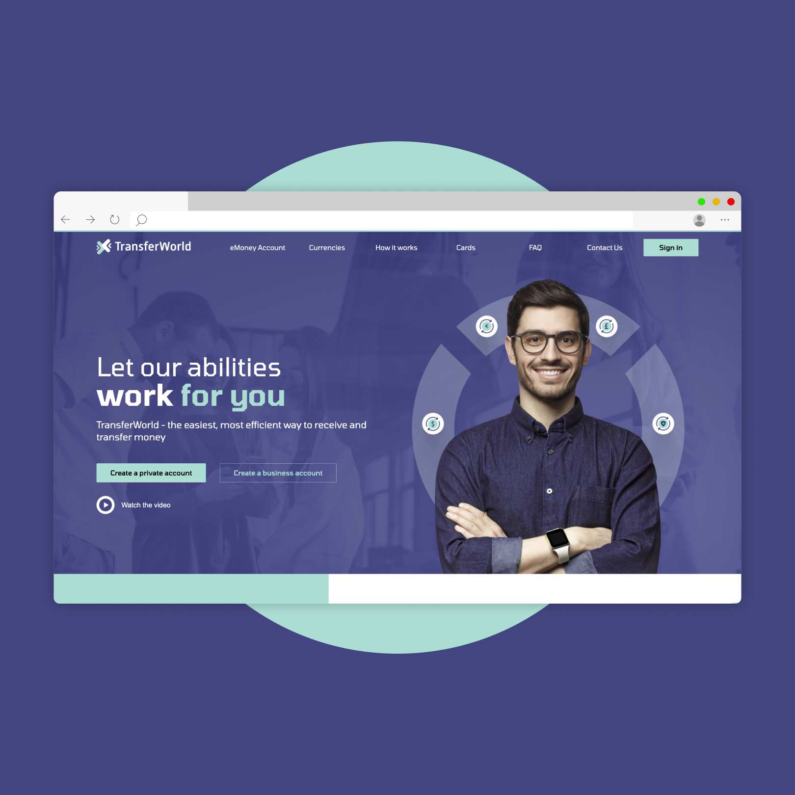
A vibrant and modern digital presence for the online payment platform, emphasizing its dynamic and youthful design, through a comprehensive overhaul of their website. This strategic enhancement not only significantly increased the brand’s online visibility but also effectively communicated the unique advantages and fundamental significance of this platform for conducting payments to the target audience, making the online payment process not just convenient, but also engaging.
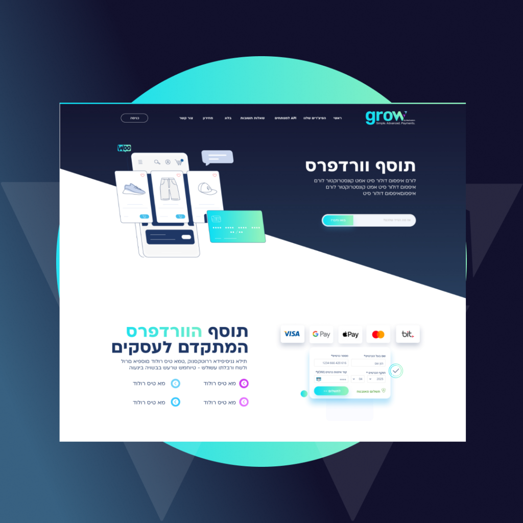
GROW Characterization and design for the new website of Mosholam Clearing Solutions or
in his new name grow. The site offers a variety of clearing solutions in a striking young marketing envelope and above all not boring in a world where everyone looks the same.
"Highly recommended!! The most professional there is, always available and gives 100% of himself just as if he were one of the partners. I already have a designer for the rest of the way, recommend to you too
"Amit is a bargain! We started with Amit as an experiment and in the end he did the whole project for us. Reliable, diligent, talented, and flexible. Amit is experienced in working with startups and was there even in the most stressful moments of the project with beautiful products. Fair prices, and excellent personal attention. A pleasure from Work. Highly recommended!
"Very professional studio. Gives personal attention. Quick response for requests and changes that came up along the way."
Amit is a super creative designer , get things done in the best way. It is always a pleasure to get his work and see how creative he is. Best part is that he get things done with a smile.



Your questions answered
Lorem ipsum dolor sit amet, consectetur adipiscing elit, sed do eiusmod tempor incididunt ut labore et dolore magna aliqua.
Lorem ipsum dolor sit amet, consectetur adipiscing elit, sed do eiusmod tempor incididunt ut labore et dolore magna aliqua.
Lorem ipsum dolor sit amet, consectetur adipiscing elit, sed do eiusmod tempor incididunt ut labore et dolore magna aliqua.
Lorem ipsum dolor sit amet, consectetur adipiscing elit, sed do eiusmod tempor incididunt ut labore et dolore magna aliqua.
When making a website, the design is a very important part of how well the site will do. It has to be one-of-a-kind and fit the needs of your business, your brand, and the user’s experience. There’s no question that a good design has a lot of pros:
First of all, all websites today have to be accessible. WordPress website design puts an emphasis on color contrast, which is important for people who are color blind, and text size, which is important for people who have trouble seeing. Your business website will be easier to use if the design is correct and of high quality.
Strengthening the brand: A well-designed website includes strategic thinking about how to talk to customers. Figuring out the visual language and having good content is a way to boost sales and get the word out about services.
Another important benefit is, of course, how the website users find it to use. The goal of every business is to get as many potential customers as possible to visit their website. But it’s not enough for a lot of surfers to visit the site. The goal is for them to stay on the site as long as possible so they can see what it has to offer and why they should choose that business over its competitors. User experience design is also a big part of how Google ranks websites.
When Google sees that surfers spend a lot of time on a site and when Google’s algorithm sees that a site has a high-quality design that is also mobile-friendly and more, it will rank that site higher than other sites, which means it will show up among the first search results when a surfer searches for something relevant. You could say that good web design also affects how the site is promoted, so it is without a doubt a good idea to put money into it.
In the first step, the professionals who will be designing the website will meet with the client to get all the information they need about the client’s needs, his target audience, the goals of the design, and other things. During this process, the team and the client will talk about what they want and set up a schedule with milestones, different deadlines for each stage of the design, the option to fix things, and more.
After getting all the information from the client, more research is done to find out what the brand’s strategy is, what colors are used for branding, what the logo looks like, and more. At this point, the first drawing will be made as well. The first drawing will be shown to the client as a sketch, and he will decide if any changes need to be made and if the idea should be “exploited” and turned into a full design.
The professional design creates an experience for the user, draws customers to the site, and keeps them there for a long time. Since all of the above factors affect a site’s ranking in Google and, by extension, its position in Google’s search results when a surfer looks for something relevant, it is very important to invest in the design of the site and make it stand out visually, be pleasant to surf on, let surfers surf in the most convenient way, and give them a good user experience.
Since design is such an important part of making a website for a business, there is no question that you shouldn’t skimp on hiring the right professionals to do the job.
Designing a website is a job that needs to be done as professionally as possible. On top of that, if you want to design a good image website, you need to hire professionals with a strong sense of imagination and creativity that pushes the limits. Studio 972 was started in 2011. It gives every business the chance to have its website designed at the highest level and to make something simple into something unique. If you work with Studio 972, at the end of the process you will have a website that is designed to meet the needs of your business and your design goals, with a unique design twist that is typical of the studio’s work.
The website design process is, without a doubt, a very important part of making a website. A website that isn’t designed well enough or in a way that fits the brand the business or the needs of the business, in general, won’t attract potential customers or show them why they should choose the business over its competitors. Over and above that, a site that isn’t designed well won’t be ranked high by Google’s algorithm, which will hurt the way it is promoted by Google.
So, if you want to make a website for your business, you should look for the best professionals in web design. Professionals who know what you want, know where to aim in their designs, and know how to do any kind of design work well will help your business website become popular and chosen by a large number of surfers.
